Apple’s Dynamic Island, a great feature or a shameless cheekiness?
Iphone 14 pro max Dynamic Island
It’s that time of the year again, guess what? Yes, you’re right! It’s about Apple upgrading its good old notorious brand in the shape of the iPhone 14 family. Apple has sold more than 1 billion iPhones · It’s on people’s minds and they are talking about it. The internet peeps have divided opinions about it. But most of them don’t see much improvement in the iPhone 14 over its previous version. They considered it the “smallest” upgrade ever in Apple history. Apple’s new pill is now awful. Apple is aware of it. You are aware of it.
In essence, many Android phones have been using this dreadful method for years. Instead of avoiding it, Apple chose to make it the focal point of their new design with some gimmicky-but-clever-but-actually-pretty-useless-but-pretty-cool-but-mostly-silly user interface elements. This approach is a true master class on how to turn a disadvantage into a benefit. Man, these people are so bold. I cherish them. I abhor them. yet I adore them the most. And continue to despise them.
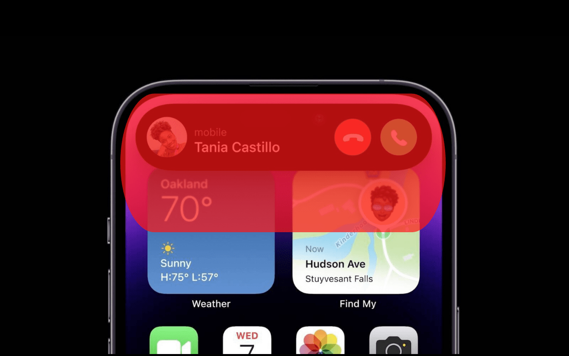
Yes, we are talking about Dynamic Island, a newly introduced feature in iPhone 14 Pro Max. It’s a part of Apple’s long history of turning water into wine. But anyways, is it really useful? Let’s find it out

It’s good to have opposable thumbs, isn’t it? Thumbs are important for how we engage with our mobile touchscreen gadgets in addition to making our lot cooler than jellyfish. According to Hoober’s research, 49% of people hold their smartphones with only one hand and use their thumbs to perform the bulk of the work. Further research by Clark revealed that 75% of interactions are thumb-driven.
This knowledge of hand location allows us to conclude that most cell phones have specific thumb mobility zones. We’ll categorize them as being in-between, difficult to access, and easy-to-reach places.


iphone 14 pro max UI flaws
Most places were simple to access when phones were smaller. As our screens became larger, it became nearly difficult to touch the top portion without adjusting your phone. We can tell where the most expensive screen real estate is from the sample above. However, it’s frequently overlooked. Iphone’s Dynamic Island falls in the red area. It’s hard to reach almost 75% of mobile phone consumers. Do you think it’s a good feature in which 75% of consumers are just selfishly ignored?

As said by the Pioneer of Personal computers and the greatest person IT has seen
“Design is not actually what it looks like and feels like. Design is how it works! – Steve Jobs
Whether or not Steve Jobs’ opinions on design are accurate, he was undoubtedly a pioneer in the field when he suggested design thinking. Under Jobs, Apple’s products, user interfaces, and marketing were all painstakingly created with the end user in mind. The products of Apple, which have millions of devoted customers worldwide, just seem right.

Another bonus reason is the smudges that users can put on the camera while clicking on notifications. The dynamic island which was used as a pill is also having some serious side effects. Users can easily put smudges on the camera which could result in smudged front-facing images. That’s a big user experience flaw.


